
Use one brand colour as a video accent, not a wash
Elevate your videos by using brand colors effectively. Learn how to create eye-catching visuals that enhance viewer engagement and drive action.

Use one brand colour as a video accent, not a wash
Put your dominant brand colour to work as an accent, a neutral backdrop, and a single supporting colour, and you’re mostly on the way to a video that looks like it belongs to your brand. Three moves matter most: place the dominant colour on your call-to-action or a key prop, keep walls and wardrobe neutral, and shoot a test frame before the full take so you can check it against your actual reference swatch. Skin tone and product colour fidelity come first, always. If a gel or graphic shifts either one, drop the intensity before you drop the shot.
Key Takeaways
Brand colour succeeds in video when it’s used as a controlled accent tested on set, not as a flat wash applied in post-production.
| Point | Details |
|---|---|
| Use the 3-colour system | Pick one dominant, one supporting and one neutral colour, adding an accent only for specific campaigns. |
| Test colour on set, not later | Shoot a reference frame with a printed swatch before every setup change to catch mismatches early. |
| Protect skin tone and product colour | Keep strong gels and accents off the key light position and mask product shots before grading around them. |
| Standardise the handoff | Use the triple-anchor method, HEX code, descriptive name, real-world object, so every department reads the same colour. |
| Move fast without a full production pipeline | Musicvideomarketplace lets musicians upload audio and branding to produce export-ready, brand-aligned long-form and short-form videos. |
Table of Contents
- Why brand colours in video shape attention before words do
- Lighting and set techniques that keep your palette accurate on camera
- Wardrobe choices that support the palette instead of fighting it
- Applying brand colour in captions, graphics and the grade
- A simple palette system your whole team can follow
- Why the graphic-design version of brand colour rules doesn’t work on set
- Frequently asked questions
- Sources
Why brand colours in video shape attention before words do
Viewers register colour before they process narrative, and that split-second read sets expectations for tone, trust and even purchase intent. Multiple production write-ups note that colour choices guide viewer expectation and emotion well before dialogue or captions land. That’s not a soft claim about aesthetics. It’s a sequencing problem: get the colour wrong in the first two seconds and you’re fighting an uphill battle for the rest of the video.
Certain hue families carry reliable associations, though context always bends them:
- Red and orange read as urgent or energetic, useful for release-day countdowns or drop announcements.
- Blue and teal read as calm and trustworthy, common in artist-brand explainer content.
- Gold and amber read as premium or nostalgic, often used in live-performance recaps.
- Green reads as fresh or organic, though it can clash badly with skin tones under tungsten light.
Saturation and contrast do the rest of the work. A highly saturated, high-contrast grade shifts a scene’s emotional register towards intensity or spectacle, while a desaturated, low-contrast grade reads as intimate or authentic. Warmer colour temperatures build trust and closeness; cooler ones build distance and polish. Choose deliberately, not by default.
Lighting and set techniques that keep your palette accurate on camera
You have two real options for injecting brand colour on set: light it in, or build it in. Coloured gels on key or accent lights, and RGB LED panels dialled to your brand’s hex value, let you tint a background or rim-light a subject without touching wardrobe or props. The alternative is physical: coloured backdrops, painted flats, or branded set pieces that hold their colour regardless of lighting drift. Production guidance from working crews tends to favour layered set dressing and selective accent lighting over saturating the whole frame, because a wash of colour across everything flattens contrast and makes skin tones harder to grade later.

The balancing act is skin tone versus brand tone. Push a magenta or amber gel too hard and you’ll shift every face in frame towards that hue, which is why accent lights usually sit behind or beside the subject rather than in the key position.
Before you roll the real take, run through this on-set check:
- White balance the camera against a neutral grey card, not against the coloured light.
- Shoot a reference frame holding your printed colour swatch next to the talent’s face.
- Check gel intensity by eye on a calibrated monitor, not the camera’s small screen.
- Confirm your camera LUT isn’t secretly warming or cooling the brand hue.
- Repeat the reference frame check any time you change lens, stop or location.
Pro Tip: Keep a physical printed swatch of your dominant brand colour in your camera bag. Screens lie under different ambient light; paper, viewed under the same light as your subject, does not.
Budget kit for this is modest: a couple of RGB LED panels with app control, a small set of coloured gels in your dominant and supporting hues, and a grey card. DMX control is nice for consistency across multi-day shoots but not essential for a single session.
Wardrobe choices that support the palette instead of fighting it
Dressing talent in your exact brand colour usually backfires. A performer wearing the same magenta as your background will either vanish into it or force a lighting compromise that desaturates their skin to keep them separated from the set. The safer move is dressing talent in neutrals, tone-on-tone variations, or a colour that sits a reasonable distance from the dominant brand hue on the colour wheel, and letting the brand colour do its job in the background, props, or graphics instead.

Texture does more separating work than colour alone. A matte neutral top against a saturated backdrop reads as distinct even without a strong colour contrast, which gives you more freedom with lighting. Watch patterns closely too: fine stripes, herringbone and tight checks can produce moiré or false colour artefacts on many camera sensors, especially under compressed streaming codecs.
Run this check in the fitting room, not on set:
- Hold each wardrobe option against the actual set or backdrop colour, not a swatch.
- Reject anything within one or two shades of the dominant brand hue.
- Pack neutral layers (black, grey, cream) as instant fixes for last-minute clashes.
- Carry safety pins and fabric tape for quick fit and drape corrections between takes.
Applying brand colour in captions, graphics and the grade
Reserve your dominant colour for the elements you want viewers to act on: a call-to-action, a subscribe prompt, a lower third naming the track. Everything else, particularly caption backgrounds and body text, should sit on a neutral so legibility never competes with brand expression. Short-form guidance from creator tools backs this restraint: keep overlays visually simple, one calm base colour and one accent for the moments that matter.
Grading is where product and merchandise colour accuracy either survives or dies. Work in a perceptually uniform space such as OKLab or CIELAB rather than raw RGB sliders, because these spaces track how human vision actually distinguishes shifts in hue and brightness. If you’re grading around a product shot, use HSL qualifiers or a selective mask to protect that specific colour range while you push saturation or warmth everywhere else. The same principle is why colour scientists favour these spaces for clustering and palette extraction over plain RGB distance.
- Export in the colour profile your platform expects; YouTube and most social platforms are forgiving, but a badly tagged profile can shift your brand hue on playback.
- Check caption contrast at final export resolution, not in your editing timeline preview.
- Test your grade against at least two device screens before calling it final.
Pro Tip: Grade your product or merchandise shot first, lock it, then grade the rest of the scene around it. Grading in the other order almost always drags the product colour along for the ride.
A simple palette system your whole team can follow
Three colours cover most brand videos: one dominant, one supporting, one neutral. Add a fourth accent only for a specific campaign moment, like a limited merchandise drop, and retire it once that push ends. Complexity beyond four colours rarely survives the handoff between shooting, editing and motion graphics.
The handoff itself is where most palettes actually break down, not the shoot. A “gold” instructed verbally to three different crew members produces three different golds. Fix that with the triple-anchor method: give every brand colour a HEX code, a plain descriptive name, and a real-world object reference (your logo’s actual gold, not “gold” in the abstract). Tools like PaletteFrame can extract a dominant palette straight from existing footage using perceptual OKLab clustering, producing a reference card with hex values and prominence data your editors can drop straight into a project file.
Accessibility is the final gate before delivery. Caption contrast needs to meet a minimum threshold to remain legible, and that threshold should be tested at final export size, not on your timeline.
- Set your dominant, supporting and neutral hex codes before the shoot, not during editing.
- Assign a triple-anchor reference to each colour and circulate it to every department.
- Test caption contrast against your darkest and lightest background grades.
| Element | Suggested contrast target |
|---|---|
| Body captions on dark background | High contrast, light text on dark base |
| Lower thirds and CTA text | High contrast, brand accent against neutral |
| Small on-screen labels | Maximum contrast, avoid mid-tone on mid-tone |
Production checklist: pre-production through delivery
- Pre-production: write a one-page palette spec with triple-anchor references, brief wardrobe and props against it.
- Shoot day: white balance against grey, capture reference frames with a printed colour card, log gel and LED settings per setup.
- Post-production: grade with product colours protected by masks or HSL qualifiers, verify caption contrast at export resolution, and confirm the export colour profile matches your target platform.
Real workflows from musicians producing brand-consistent video
Musicians and labels who treat colour as part of the release plan, not an afterthought, tend to get more consistent results across long-form and short-form cuts of the same song. Musicvideomarketplace’s own resources cover this from the production side, including how brand guidelines translate into cinematography and motion graphics and why labels increasingly treat video as a marketing line item rather than a one-off cost. Case examples and internal performance figures will be added here as they become available.
Why the graphic-design version of brand colour rules doesn’t work on set
Most brand colour advice comes from graphic design, where colour sits flat on a printed page or a static screen. Video is a different problem entirely: your brand colour has to survive changing light, moving subjects, codec compression and a dozen different playback screens, and most style guides never account for that. The conventional advice, pick your hex codes and hand them to the team, quietly assumes someone downstream understands how gels, white balance and grading will bend that hex code before it reaches the viewer.
What the evidence in this piece actually supports is a production-first hierarchy: protect skin tone and product colour first, treat your dominant brand hue as an accent rather than a wash, and build the handoff around the triple-anchor method rather than a static colour chart nobody checks against the actual footage. Teams that skip the on-set testing step, the reference frame, the grey card, the printed swatch, are the ones who end up “fixing” brand colour in a grading suite weeks later, usually at the cost of skin tone accuracy.
If you take one thing from this: test on set, not in post. A five-minute reference frame check costs nothing. A colour mismatch discovered after the shoot wraps costs a reshoot, or a compromise nobody’s happy with.
Get brand-consistent music videos without building a production pipeline
Musicvideomarketplace exists for exactly the gap this guide describes: getting your dominant colour, wardrobe and grading right takes crew, kit and testing time most independent artists and small labels don’t have on a single-song budget. Musicvideomarketplace gives musicians and their teams a marketplace of human-made, ready-to-edit, full-length music videos, so you can upload your audio and branding, get YouTube-ready exports, and generate short social clips without booking a shoot from scratch.
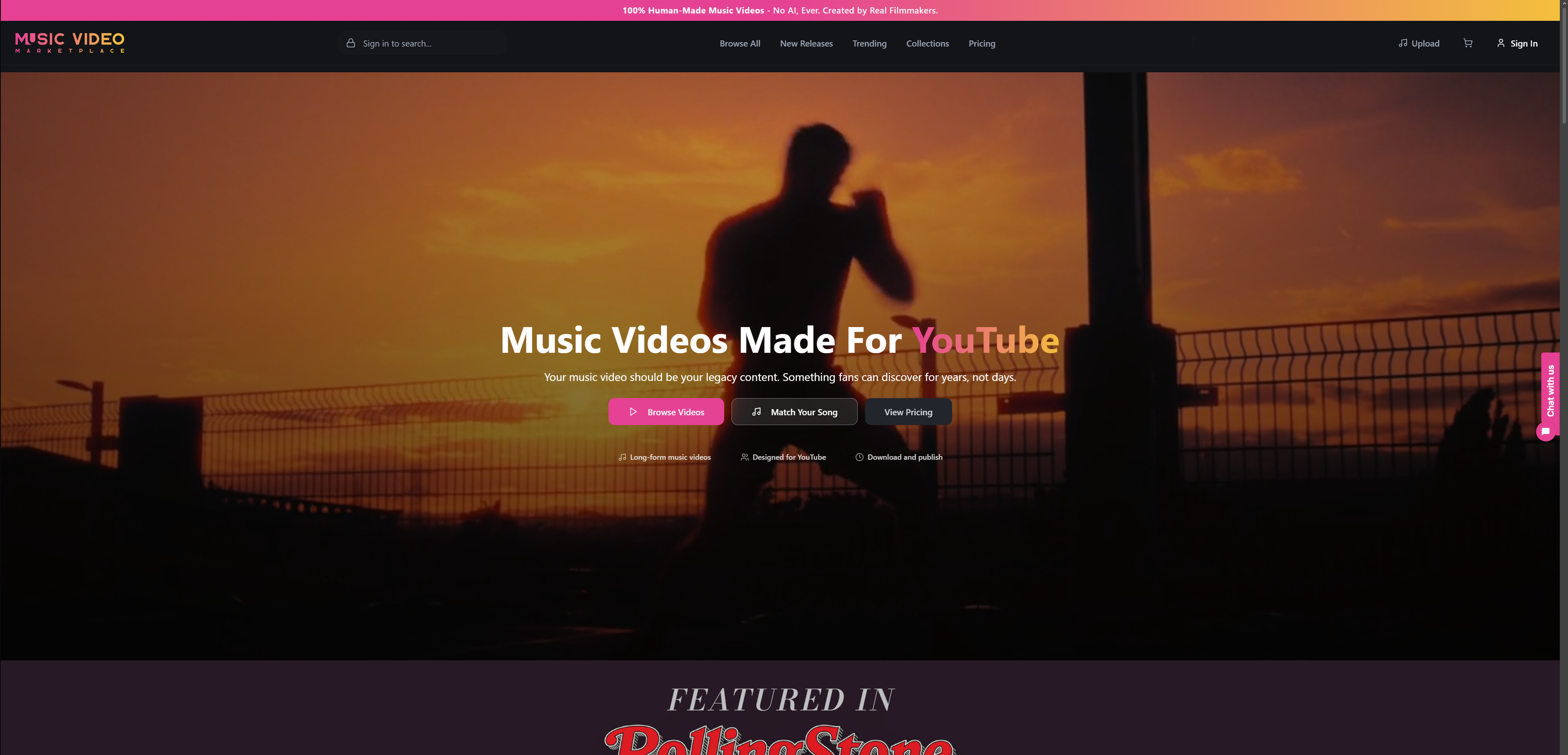
Every video comes ready for your branding handoff, including export-ready assets sized for both long-form and short-form platforms, so your dominant colour and supporting palette carry through consistently. Once your video’s ready, you can launch an ad campaign for the track straight from the same platform. Browse the current catalogue at Musicvideomarketplace and see how quickly a brand-aligned video comes together.
Frequently asked questions
How many brand colours should appear in one video? Three is the practical ceiling for most brand videos: one dominant, one supporting, one neutral. A fourth accent works for a limited campaign moment but should retire once that push ends.
Should talent wear the dominant brand colour on camera? Generally no. Wardrobe in or near the exact dominant hue tends to either desaturate against the background or force a lighting compromise that flattens skin tone. Neutrals or tone-on-tone alternatives work better.
What’s the fastest way to check if brand colours will read consistently in video? Shoot a reference frame holding a printed colour swatch next to the talent before the full take, and check it on a calibrated monitor rather than the camera’s built-in screen.
Why use perceptual colour spaces like OKLab instead of RGB for grading? OKLab and CIELAB track how human vision actually perceives shifts in hue and brightness, which makes palette extraction and grading adjustments more accurate than raw RGB distance calculations.
Does caption colour need to meet an accessibility standard? Yes. Captions need sufficient contrast against their background to stay legible, and that contrast should be checked at final export resolution and codec, since platform compression can shift colours from what you see in your editing timeline.
Sources
- PaletteFrame
- How to incorporate brand colours into video production
- Color psychology in video: how colour grading shapes emotions
- Video colour psychology for creators
- OKLab colour space (Wikipedia)
Recommended
- Music Branding Through Video: Amplifying Artist Identity | Music Video Marketplace Blog
- What is visual branding: a guide for creatives | Music Video Marketplace Blog
- Role of video in beat marketing: 2026 guide | Music Video Marketplace Blog
- Why producers use video campaigns: the 2026 guide | Music Video Marketplace Blog
Read next
 Common challenges in label video production: 2026 guideDiscover the common challenges in label video production and learn effective strategies to overcome obstacles for timely, budget-friendly projects.
 7 Inspiring Examples of Viral Music Videos for ArtistsDiscover 7 exciting examples of viral music videos and learn practical tips to boost your YouTube engagement as an independent musician or emerging artist.
 Girls on Film Mallorca EditThe Music Video Marketplace team headed to Mallorca to film new EDM-inspired videos with models Avah Huppe and Krysten-Rose Armstrong. The trip mixed creativity, teamwork, and sunshine — and the new videos are now live on www.musicvideomarketplace.com
.
 Audio Reactive Visuals: A Musician's Guide to Visuals That Move With Your TrackHow audio reactive visuals work, how to match them to drum and bass, EDM, lofi and ambient tracks, and how to get a YouTube-ready video released fast.
Turn the idea into a finished music video.
Drop your track into the Studio and build your visual in minutes.