
What is visual branding: a guide for creatives
Discover what visual branding is and how it can boost your revenue by 23%. Transform your marketing strategy with effective visual identity.

What is visual branding: a guide for creatives
TL;DR:
- Visual branding is a strategic system that ensures consistent use of logos, colors, typography, and imagery. It builds trust, recognition, and can increase revenue by up to 23 percent when applied uniformly across touchpoints.
Visual branding is the strategic system that uses logos, colour palettes, typography, and imagery to communicate what a brand stands for across every customer interaction. The industry term for the underlying asset collection is “visual identity,” but visual branding is the governance layer that puts those assets to work consistently. Businesses with consistent visual branding can see up to 23% more revenue. That figure reflects a simple truth: when every touchpoint looks and feels the same, audiences recognise and trust a brand faster. For creatives and business owners, understanding this system is the foundation of any serious marketing strategy.
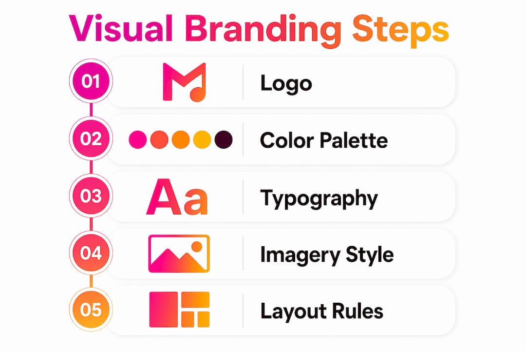
What is visual branding and what does it consist of?
Visual branding is not a single asset. It is a coordinated system of visual decisions that, taken together, shape how an audience perceives a brand before a single word is read.
The core elements are:
- Logo. A logo is a visual shortcut, not the whole brand. It signals recognition, but it carries meaning only when supported by everything around it.
- Colour palette. A defined palette includes HEX values for digital screens, RGB for on-screen rendering, CMYK for print, and Pantone references for physical production. Colour profiles must be defined for both digital and print to prevent brand dilution through mismatch.
- Typography. Font choices and hierarchy, meaning which typeface leads, which supports, and at what sizes, determine whether a brand reads as authoritative, playful, or minimal.
- Imagery style. Photography, illustration, and graphic composition all carry emotional weight. A brand that uses high-contrast, gritty photography communicates something entirely different from one that uses soft, pastel-toned lifestyle shots.
- Layout and spacing. The way elements are arranged on a page or screen creates a visual rhythm. Consistent margins, grid systems, and white space usage make a brand feel considered rather than accidental.
All of these elements are governed by a brand style guide, a centralised document that sets the rules for how assets are used across every channel. Brand style guides are critical to maintaining consistency across platforms. Without one, individual designers, marketers, and agencies make their own calls, and the brand slowly fragments.
Pro Tip: Build your style guide before you launch any campaign. Retrofitting rules onto existing assets costs far more time and money than defining them upfront.

How does visual branding differ from brand identity?
These three terms are often used interchangeably, but they describe distinct layers of a brand.
| Term | What it covers | Primary function |
|---|---|---|
| Visual identity | Static assets: logo, colours, fonts, imagery | The collection of brand materials |
| Visual branding | Strategic governance of those assets | Ensuring consistent application across all touchpoints |
| Brand identity | All of the above plus voice, mission, values, and personality | The full expression of what a brand is |
Visual identity refers to the static assets; visual branding is the strategic governance system that puts those assets to work. Brand identity is the broadest layer. It includes non-visual elements such as tone of voice, brand mission, and the values a company communicates through its behaviour.
A useful way to think about it: visual identity is the wardrobe, visual branding is the dress code, and brand identity is the personality of the person wearing the clothes. A brand can have a beautifully designed logo and a well-chosen colour palette, yet still feel incoherent if the governance layer is missing. Misalignment between visual style and brand personality is one of the most common and damaging errors a business can make.
The practical implication for creatives and business owners is this: do not stop at creating assets. Define how, when, and where those assets are used. That governance is where the real value lives.
Why is visual branding important for your business?
Strong visual branding builds trust before a conversation starts. As one widely cited description puts it, visual branding is the “silent handshake” that communicates reliability before any interaction occurs. That handshake happens in milliseconds.
Customers form snap judgements based on total visual language, not just logos, influencing trust instantly. This means a mismatched font or an off-brand colour choice can undermine credibility just as quickly as a strong visual system can build it. The psychological effect is real and measurable.
Inconsistent visual identity causes cognitive dissonance, undermining brand credibility. When a brand looks different on its website, its social media, and its printed materials, audiences sense the inconsistency even if they cannot name it. The result is a vague feeling that the brand is unreliable or unprofessional.
“A logo is only a single symbol within a larger system; the total visual language shapes perceptions.” — 43frames
For musicians and artists, this principle is especially sharp. Your visual branding is often the first thing a potential fan or industry contact encounters. The way your artwork, video content, and social presence look together either builds or erodes the impression you are trying to create. Musicvideomarketplace works directly in this space, helping artists build a consistent visual presence through video content that reinforces their brand at scale. Understanding branding in the music industry shows just how directly visual consistency translates into audience growth and commercial opportunity.
How to create a visual branding strategy that lasts
Building a visual branding system that holds up over time requires deliberate choices at every stage. The following steps reflect best practice across creative and commercial contexts.
- Define your brand personality first. Visual decisions should follow from who your brand is, not from what looks fashionable right now. Trendy designs that clash with brand values create a trust gap. Brand personality must guide visuals, not the other way around.
- Choose your colour palette with technical precision. Select colours that reflect your brand’s character, then define every technical variant: HEX, RGB, CMYK, and Pantone. This prevents the gradual drift that happens when different teams work from memory or approximation.
- Set typography hierarchy early. Decide on a primary typeface, a secondary typeface, and the size relationships between headings, subheadings, and body text. Defining typography hierarchy and colour contrast early prevents costly retrofits and improves accessibility. Accessibility standards should be built in from the start, not added later.
- Document everything in a brand style guide. A centralised brand style guide governs asset usage across all channels and prevents degradation over time. Include rules for logo usage, colour application, typography, imagery style, and layout principles.
- Apply your system across every channel. Your website, social media profiles, video content, email templates, and printed materials should all draw from the same visual rules. Consistency across channels is what turns individual assets into a recognisable brand.
- Review and update regularly. Visual branding is not a one-time project. Brands evolve, platforms change, and audience expectations shift. Schedule a visual audit at least once a year to check that your assets still reflect your brand accurately.
Pro Tip: When auditing your visual branding, print out examples from every channel side by side. Inconsistencies that are invisible on screen become obvious when you see them together.
For musicians building their artist identity through video, applying these steps to your visual content strategy creates a coherent presence that audiences recognise and remember.
Examples of visual branding in practice
Strong visual branding is visible in brands where every touchpoint feels like it belongs to the same family. Consider a music artist whose album artwork, social media posts, merchandise, and music videos all share the same colour palette, typographic style, and photographic treatment. Audiences do not need to see a logo to know whose content they are looking at. That recognition is the goal.
A practical audit of your own visual branding can follow this checklist:
- Do your logo, colours, and fonts appear consistently across your website, social media, and any printed or physical materials?
- Are your colour values documented in HEX, RGB, and CMYK so that every designer working on your brand uses the exact same shades?
- Does your imagery style, whether photography, illustration, or video, feel consistent in tone, composition, and colour treatment?
- Is there a written style guide that any new collaborator could pick up and follow without asking you questions?
- Does your visual style reflect your actual brand personality, or does it reflect what was fashionable when you first launched?
If the answer to any of these is no, that is where your visual branding work begins. For creatives working across digital platforms, visualiser videos offer a practical way to extend visual branding into moving image content, reinforcing brand recognition on platforms like YouTube where static assets alone are not enough.
The warning signs of inconsistent branding are easy to spot once you know what to look for: different shades of your brand colour appearing across platforms, multiple font styles used without a clear hierarchy, and imagery that shifts in tone from professional to casual without reason.
Key takeaways
Visual branding is the governance system that turns individual assets into a coherent, recognisable brand presence across every touchpoint.
| Point | Details |
|---|---|
| Visual branding is a system | It governs how logos, colours, typography, and imagery are used, not just what they look like. |
| Consistency drives revenue | Businesses with consistent visual branding can see up to 23% more revenue across all touchpoints. |
| Style guides are non-negotiable | A centralised brand style guide prevents asset drift and keeps every channel aligned. |
| Accessibility must come first | Define typography hierarchy and colour contrast at the start to avoid expensive fixes later. |
| Brand personality leads visuals | Visual choices should reflect brand values, not current design trends. |
Visual branding: what I have learned from watching brands get it wrong
The most common mistake I see from creatives and business owners is treating the logo as the brand. They spend weeks agonising over a logo, then apply it inconsistently across every channel with different colours, different fonts, and imagery that has nothing to do with the identity they were trying to build. The logo becomes a badge on a fragmented experience.
The second mistake is building visual assets without governance. A beautiful logo, a carefully chosen colour palette, and a strong typeface are worth very little if there are no documented rules for how they are used. The moment a second designer, a social media manager, or a print supplier touches those assets without a style guide, the brand starts to drift.
What actually works is starting with personality. Before any visual decision is made, a brand needs to know what it stands for, who it is speaking to, and what feeling it wants to create. Every visual choice follows from that. A serious, authoritative brand that uses playful, informal graphics is not just inconsistent. It is confusing, and choosing aesthetic elements misaligned with brand values actively damages trust.
The brands I have seen build lasting recognition are the ones that treat visual branding as an ongoing discipline, not a launch task. They audit regularly, update thoughtfully, and govern rigorously. Creativity within a defined system produces far stronger results than creativity without constraints.
— Music
How Musicvideomarketplace supports your visual brand
Video is one of the most powerful visual branding tools available to creatives and business owners. A well-produced video communicates colour, tone, typography, and personality in a way that static assets simply cannot match.

Musicvideomarketplace enables musicians to create long-form video content in minutes, ready to upload to YouTube and pair with an ad campaign for their song. That means your visual branding reaches audiences at scale, on one of the world’s largest platforms, without the production overhead that typically makes video inaccessible. Browse video examples on Musicvideomarketplace to see how artists are using video to build a consistent, recognisable visual presence. If you are building your brand identity from the ground up, the musician’s branding guide on the site offers a practical starting point.
FAQ
What is the definition of visual branding?
Visual branding is the strategic system that governs how visual elements such as logos, colours, typography, and imagery are applied consistently across all brand touchpoints. It is distinct from visual identity, which refers to the static assets themselves.
What are the core visual branding elements?
The core elements are logo, colour palette, typography, imagery style, and layout principles. Each element must be documented in a brand style guide to ensure consistent application.
Why does visual branding matter for revenue?
Businesses with consistent visual branding can see up to 23% more revenue. Consistency builds recognition and trust, which directly influences purchasing decisions.
How is visual branding different from brand identity?
Brand identity is the broadest concept and includes voice, mission, and values alongside visual elements. Visual branding is specifically the system for governing how visual assets are used to express that identity.
How do I start building a visual branding strategy?
Define your brand personality first, then choose visual elements that reflect it. Document every decision in a centralised style guide and apply those rules consistently across every channel from day one.
Recommended
- A musician’s guide to music branding: build your identity | Music Video Marketplace Blog
- Music Branding Through Video: Amplifying Artist Identity | Music Video Marketplace Blog
- Visualisierung im Musikmarketing: Dein Praxisleitfaden | Music Video Marketplace Blog
- Die Role von Visuals für DJ-Marken 2026 | Music Video Marketplace Blog
Read next
 What is visual branding for DJs: a complete guideDiscover what visual branding for DJs is and how it builds your identity, attracts fans, and boosts your career. Get the complete guide now!
 Why content diversification for DJs matters in 2026Discover why content diversification for DJs is crucial in 2026. Engage audiences and protect your brand from social media volatility.
 Why content quality impacts music successDiscover why content quality impacts music success and how it drives listener engagement. Elevate your music strategy for 2026!
 What is social proof in music: a guide for musiciansDiscover what social proof in music means and how it influences listener perceptions. Boost your career with effective strategies today!
Turn the idea into a finished music video.
Drop your track into the Studio and build your visual in minutes.