
YouTube thumbnail safe area: a 2026 guide for creators
Master the YouTube thumbnail safe area with our 2026 guide. Ensure your designs stay visible and impactful, avoiding critical cuts.
YouTube thumbnail safe area: a 2026 guide for creators
Keep every face, logo and word inside the central 1100 × 620px of your 1280 × 720 canvas, and you’ll survive almost any crop, badge or overlay YouTube throws at it. That’s the whole rule in one sentence.
The one thing to actually avoid: the bottom-right corner, where the duration badge sits, and the outer 6% margin on all four sides, which gets clipped or shadowed across different placements.
- Design inside the centre band, not the full frame.
- Never anchor faces, logos or text in the bottom-right corner.
- Re-export at exactly 1280 × 720px, under 2MB, before uploading.
Key Takeaways
The YouTube thumbnail safe area protects your click-through rate by keeping faces, logos and text inside the central 1100 × 620px band of a 1280 × 720 canvas, clear of the duration badge and edge crops.
| Point | Details |
|---|---|
| Safe area dimensions | Keep key content inside roughly 1100 × 620px on a 1280 × 720 canvas. |
| Avoid the bottom-right corner | The duration badge overlays that corner on nearly every placement. |
| Design for small screens | Test at mobile feed size (roughly 246 × 138px) before trusting a design. |
| Export settings | Use JPG at 80 to 90% quality, 1280 × 720px, to stay under the 2MB cap. |
| Test across placements | Check mobile, sidebar, channel page, desktop search and TV before publishing. |
Table of Contents
- What is the YouTube thumbnail safe area, and why does it matter?
- What are the exact safe-zone dimensions for a 1280 × 720 thumbnail?
- How do mobile, desktop, TV and embeds change what viewers see?
- What design rules keep faces and text readable in the safe zone?
- What safe-zone mistakes do creators make, and how do you fix them?
- Where can you find safe-zone templates and overlay testers?
- What are the exact export and upload settings to use?
- How do you test your thumbnail before it goes live?
- Frequently asked questions
- Sources
What is the YouTube thumbnail safe area, and why does it matter?
The YouTube thumbnail safe area is the central portion of your thumbnail canvas that stays visible no matter where or how the thumbnail is displayed. It’s the part YouTube’s interface never covers, crops, or obscures, regardless of device or placement.
That matters because YouTube layers several UI elements directly on top of your image:
- The duration timestamp, bottom-right corner
- A dark gradient or progress bar along the bottom edge
- The video title bar when embedded on other sites
- Channel row branding and rounded-card cropping in feeds and playlists
Ignore these and you get cropped faces, hidden text, and a hook that never lands. If your click-through hinges on a shocked expression or a bold three-word headline, and that detail sits under the timestamp, it simply isn’t seen. The safe area exists because the thumbnail canvas and the visible thumbnail are two different things.
What are the exact safe-zone dimensions for a 1280 × 720 thumbnail?
Build to the full 1280 × 720px canvas, YouTube’s recommended size for custom thumbnails, but treat only the inner rectangle as guaranteed real estate.
The reliably visible core sits at roughly 1100 × 620px, centred on the canvas. That works out to about 86% of the width and 86% of the height, leaving an edge margin of around 6% on every side to absorb rounded-card cropping and screen overscan on TVs.
| Zone | Pixel dimensions | Notes |
| — | — | — | | Full canvas | 1280 × 720px | Export size; never crop below this | | Safe area (centre) | approx. 1100 × 620px | Faces, logos, key text live here | | Edge margin (all sides) | approx. 6% each | Reserve for overscan and card rounding | | Duration badge zone | bottom-right corner | Timestamp overlay; keep clear | | Bottom strip | full width, lower edge | Gradient/progress bar territory |
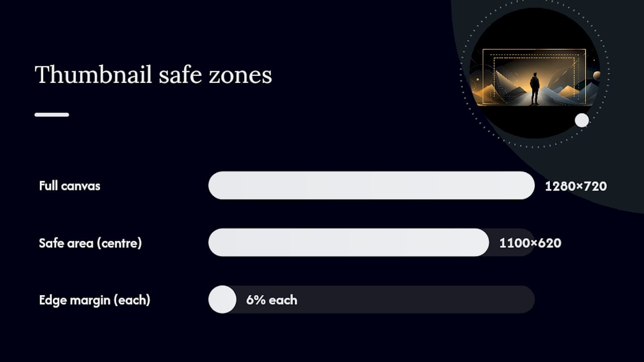
A browser-based safe zone checker overlays these exact bands onto your image, which beats eyeballing margins in your editor.
How do mobile, desktop, TV and embeds change what viewers see?
YouTube’s player adapts to each video’s native aspect ratio rather than forcing a fixed frame, which is why adding your own letterbox or pillarbox padding around a thumbnail backfires. The platform already auto-frames content, so your padding just eats into space you needed for the subject.
Rendered size varies wildly by placement:
- Mobile home feed thumbnails often display at roughly 246 × 138px, tiny enough that fine detail vanishes.
- Suggested-video sidebars on desktop run larger but still shrink text more than you’d expect.
- TV apps and large-screen embeds introduce overscan, which can trim edges further than a phone screen would.
Pro Tip: Always judge your thumbnail at the smallest size it’ll realistically appear, not the size you’re designing it at. If a face or word disappears at phone scale, it needs to move or grow before it goes anywhere near the smallest rendered size.
What design rules keep faces and text readable in the safe zone?
Three things separate a thumbnail that survives compression from one that turns to mush: text discipline, face placement, and breathing room.
For text, cap yourself at three to four words, set in large, bold type with strong contrast against the background. Thin strokes and fine serif detail vanish the moment YouTube compresses your file, so skip them entirely.
Keep eyes and the key expression inside that central band rather than tucking a face into a corner, where it risks cropping in narrower placements. Design-for-small-screen thinking consistently outperforms detail-heavy layouts once you factor in how most viewers actually encounter a thumbnail, at a glance, on a small screen, next to a dozen competitors.
Composition-wise, leave genuine breathing room from every edge rather than letting elements touch the border. Strong separation between subject and background reads instantly at a glance, and your thumbnail should complement your title copy rather than repeat it. If your headline says “the secret formula,” your thumbnail shouldn’t also spell that out in text.
What safe-zone mistakes do creators make, and how do you fix them?
- Mistake: placing key text bottom-right. That’s exactly where the duration badge lands. Fix: shift text to upper-centre or left-centre, well clear of that corner.
- Mistake: exporting below 1280 × 720 or in the wrong aspect ratio. Low-resolution uploads look soft once YouTube’s compression kicks in. Fix: always export at the full 1280 × 720px canvas and check the final file dimensions before upload.
- Mistake: oversized PNGs or over-compressed JPGs. PNGs frequently exceed YouTube’s 2MB cap, while heavy compression introduces visible artefacts. Fix: export as JPG at roughly 80 to 90% quality, which keeps files under the limit without sacrificing sharpness.
Each of these is a five-minute fix in your export settings, not a redesign.
Where can you find safe-zone templates and overlay testers?
You don’t need to draw safe-zone guides freehand every time. Adobe Express publishes official YouTube image size guidance alongside templates with the safe area already marked, which is a fast starting point for building your own labelled guide. Overlay tools built specifically for this, sometimes described as Thumix-style safe-zone overlays, layer the duration badge, title bar and edge-crop bands directly onto your working file so you can see exactly where danger zones sit before you export anything.
Beyond templates, dedicated checkers exist purely to simulate placement. Run a draft thumbnail through one before publishing, and you’ll catch a corner-anchored logo or clipped word in seconds rather than after the video’s already live.
Pro Tip: Build one locked 1280 × 720 template with your centre guides baked in and export presets saved. Once it exists, every future thumbnail takes minutes instead of starting from a blank canvas.
What are the exact export and upload settings to use?
Export at 1280 × 720px, 16:9 aspect ratio, every time. For photo-heavy thumbnails, JPG at 80 to 90% quality is the reliable way to stay under YouTube’s 2MB cap while keeping detail intact.
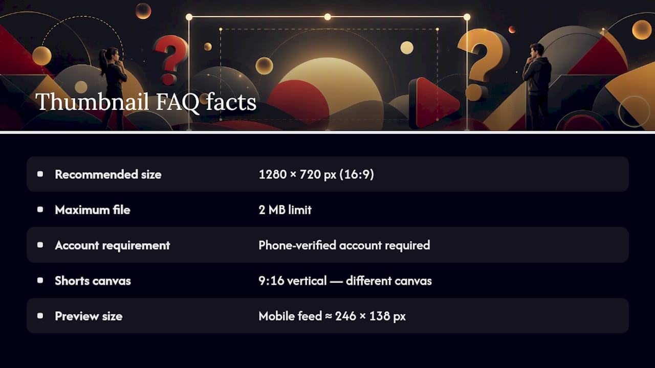
- Custom thumbnails require a phone-verified YouTube account; without verification, you’re stuck with auto-generated frames.
- Shorts use a 9:16 vertical frame, a different canvas entirely from the 1280 × 720 rule covered here.
- PNGs frequently exceed the 2MB limit and can cause upload rejection outright; if you must use PNG, run it through a compressor first or switch to JPG.
YouTube’s own thumbnail guidelines also note that custom-thumbnail privileges can be revoked for Community Guidelines violations, so it’s worth keeping your channel in good standing quite apart from the technical specs.
How do you test your thumbnail before it goes live?
- View your file at 25% zoom inside your editor to get a rough sense of small-scale legibility.
- Send it to your phone and look at it genuinely at thumbnail size, not full-screen.
- Run it through a safe-zone simulator to check badge, title-bar and edge-crop overlap.
- Preview it embedded in YouTube Studio to see how it renders in an actual player context.
Check it across placements that behave differently: the mobile feed, the suggested sidebar, your channel page, desktop search results, and TV or large-screen apps where overscan trims more than you’d expect. One thing worth knowing: replacing a thumbnail doesn’t update instantly everywhere. YouTube’s caching means a swapped image can lag behind across surfaces, so build a buffer into your publishing timeline if you’re testing variants close to launch.
Why designing for the smallest screen first actually works
Design for the smallest screen your thumbnail will ever appear on, then everything larger takes care of itself. That’s the opposite of how most people work, building big and hoping it shrinks well, and it’s the single habit that separates thumbnails that hold up from ones that fall apart under compression. At Music Video Marketplace, building thumbnail templates for music releases taught us that a locked safe-zone guide saves more revisions than any amount of last-minute polish. Bake the check into your workflow, not your final review.
Frequently asked questions
What size should a YouTube thumbnail be? Export at 1280 × 720px, a 16:9 aspect ratio. That’s YouTube’s recommended thumbnail dimensions, and anything smaller risks looking soft once the platform compresses it.
What is the maximum thumbnail size YouTube allows? YouTube caps custom thumbnails at 2MB. JPG files at 80 to 90% quality typically stay well under that limit; PNGs often don’t.
Do I need a verified account to upload custom thumbnails? Yes. Custom thumbnails require a phone-verified YouTube account. Without verification, YouTube generates frames from your video automatically.
Are Shorts thumbnails the same safe area as regular videos? No. Shorts use a 9:16 vertical frame, a completely different canvas from the 1280 × 720 rule that governs standard video thumbnails.
Why does my thumbnail look fine in my editor but bad on YouTube? Most likely you designed at full size without checking how it renders when shrunk. Preview at mobile feed scale, roughly 246 × 138px, before finalising anything.
Ready to skip the guesswork entirely? Browse ready-made music video templates on Musicvideomarketplace, built with export-ready thumbnails that already respect the safe zone, so you can upload and launch your ad campaign the same day.
Sources
- Custom thumbnails | YouTube Help
- Your guide to YouTube image sizes | Adobe Express
- YouTube Thumbnail Safe Zone Checker (Free Overlay)
Recommended
- Types of music thumbnails: the 2026 creator’s guide | Music Video Marketplace Blog
- Angles de visibilité sur YouTube : guide 2026 | Music Video Marketplace Blog
- Guide to YouTube music uploads for indie artists 2026 | Music Video Marketplace Blog
- Analyse des formats vidéo YouTube en 2026 | Music Video Marketplace Blog
Read next
 Artist video content strategy for YouTube success 2026Discover how independent musicians can develop an effective video content strategy for YouTube in 2026, maximising engagement, visibility, and audience growth through strategic planning and execution.
 Benefits of consistent label content output for UK labelsDiscover the benefits of consistent label content output. Boost audience growth, improve engagement, and turn listeners into fans today!
 Benefits of YouTube promotion for musicians in 2026Discover the benefits of YouTube promotion for musicians in 2026. Unlock your music's potential and gain the audience you deserve!
 YouTube Promotion for Musicians: Driving Global ImpactYouTube promotion for musicians boosts song discovery, fan engagement, and career growth using ads, long-form video, and data-driven strategies.
Turn the idea into a finished music video.
Drop your track into the Studio and build your visual in minutes.